Invigorating a dragon
For over 25 years, the Anvil Business Club has served as an avenue for young entrepreneurs and professionals of Filipino-Chinese descent to share and promote progressive practices and ethical values in their respective disciplines. Since 1991, it has molded outstanding business leaders that have influenced the local industry in groundbreaking ways.
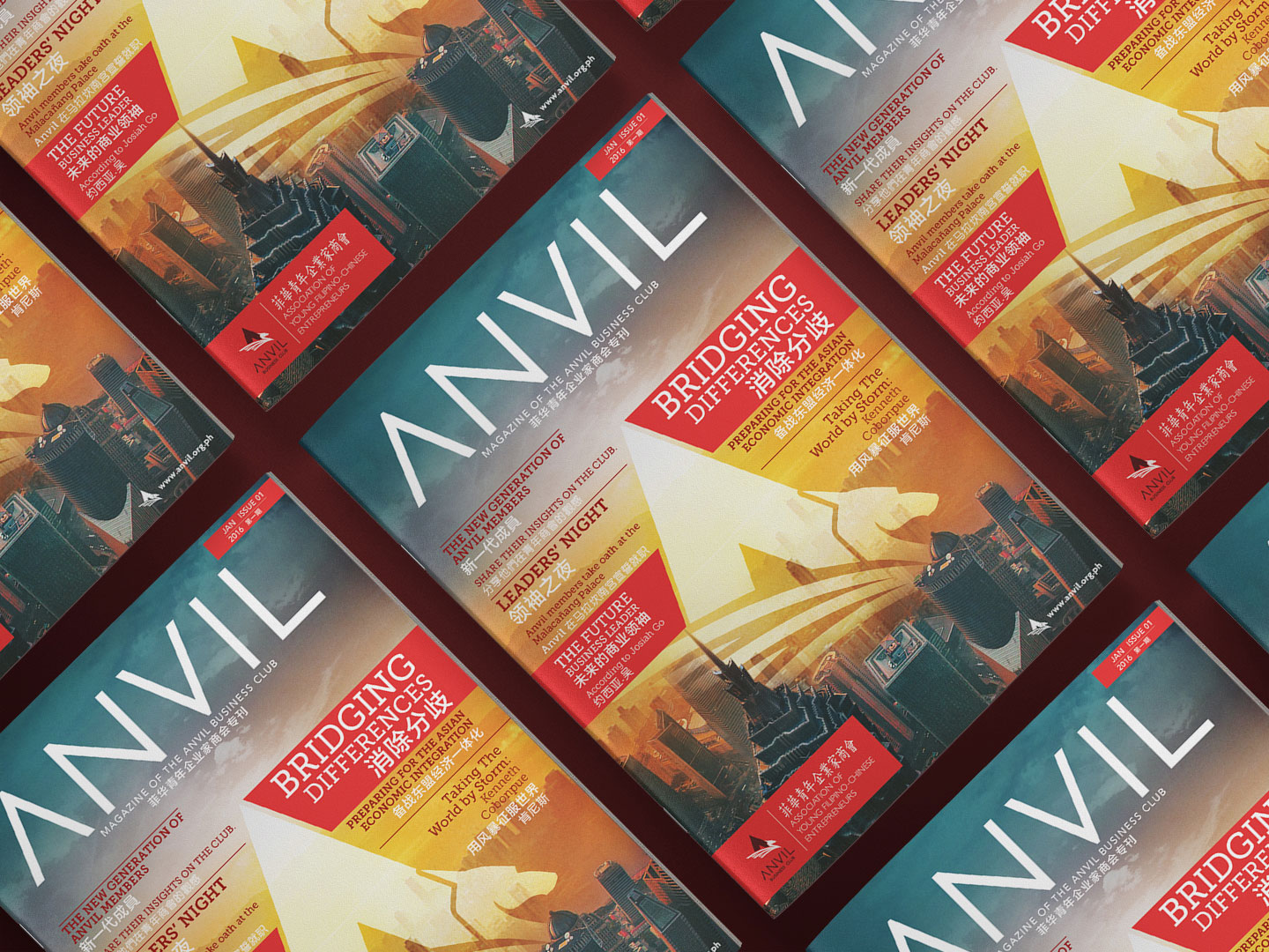
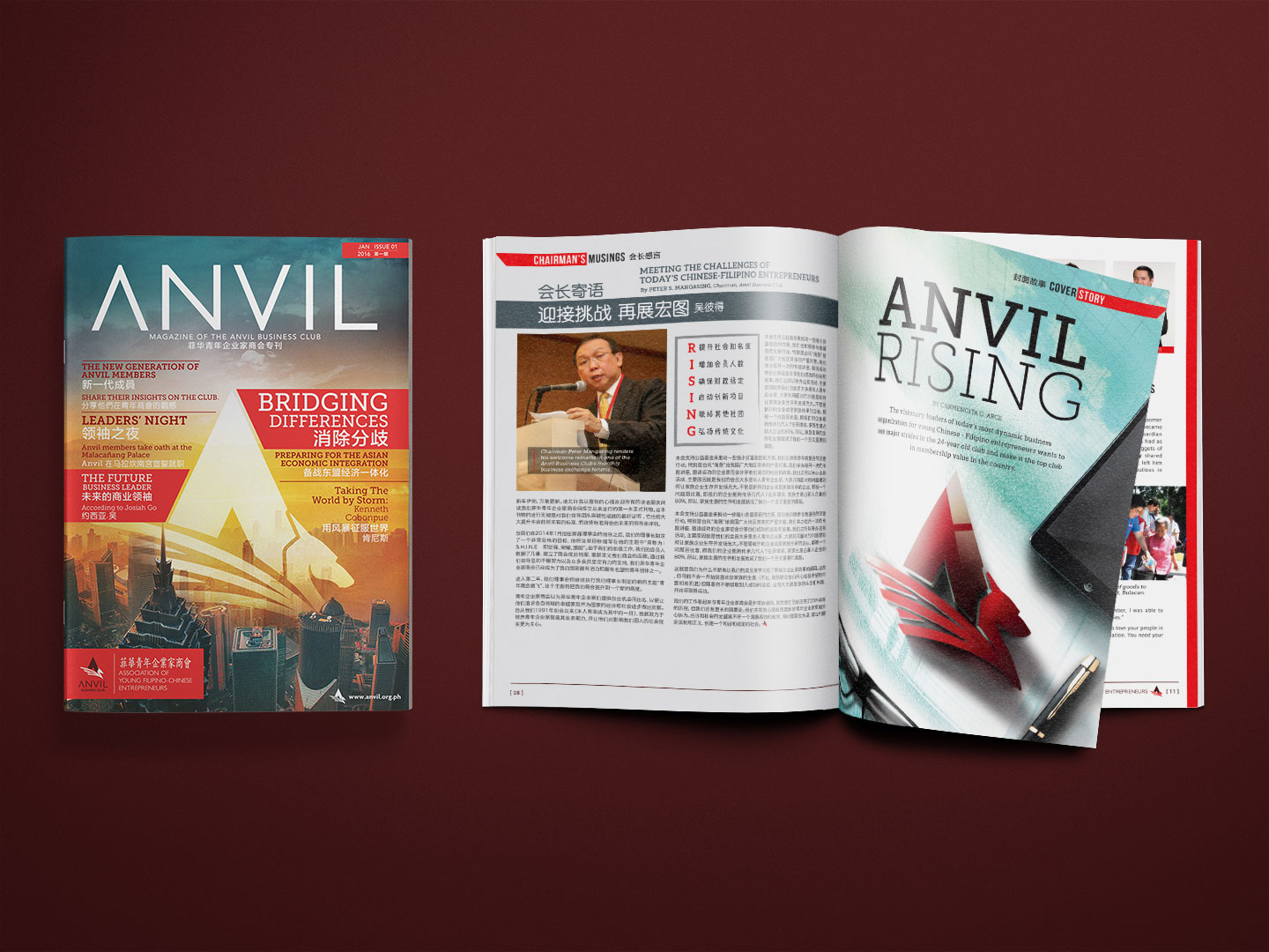
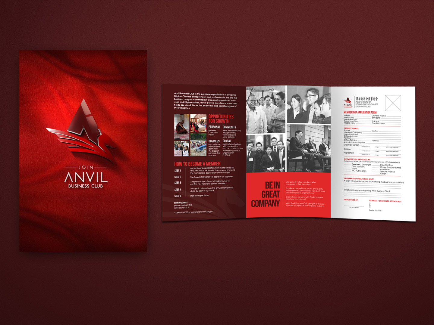
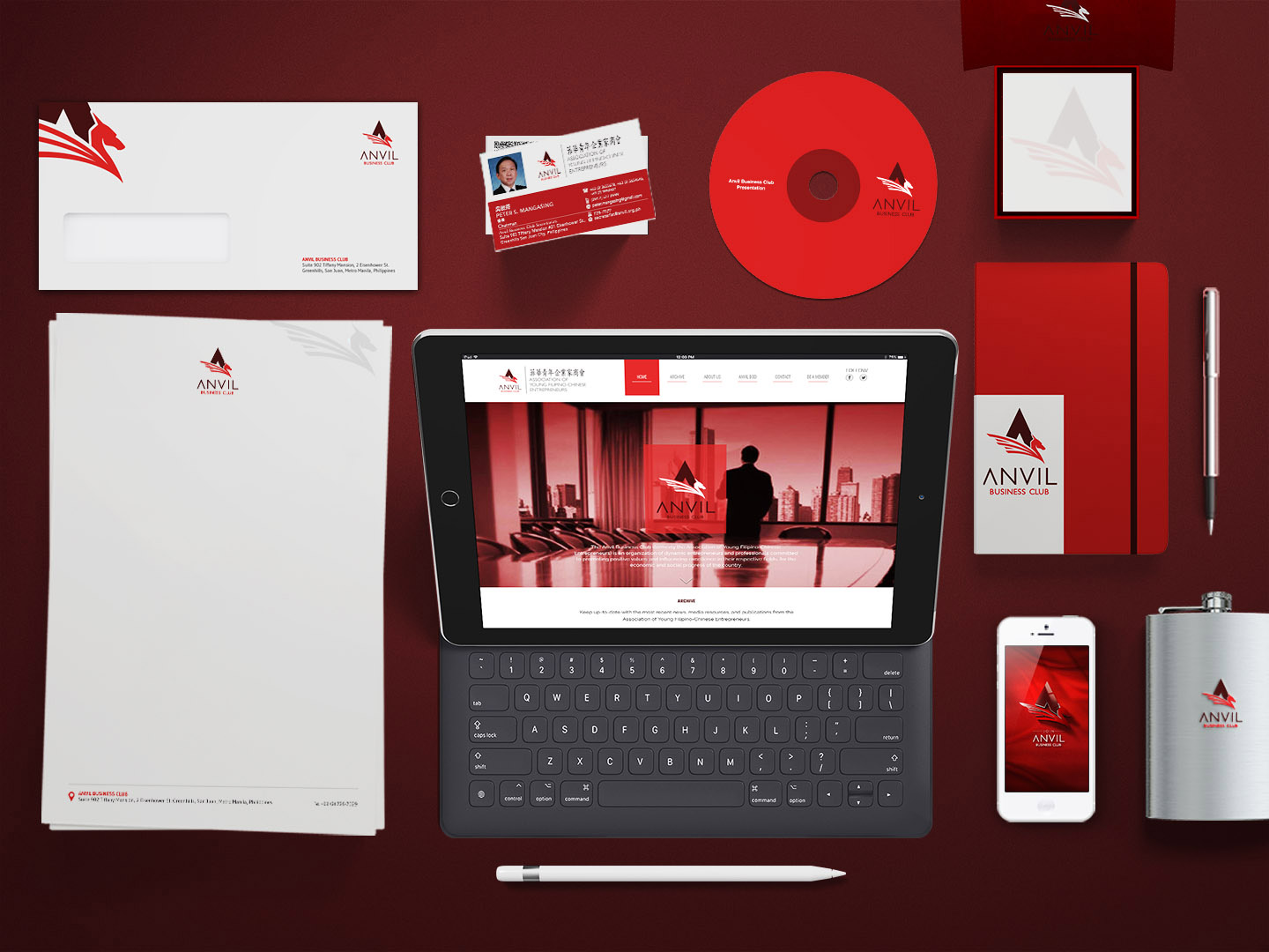
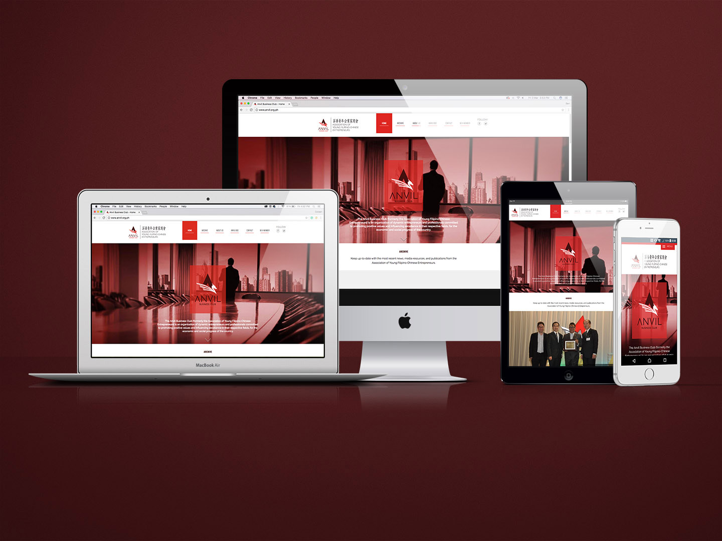
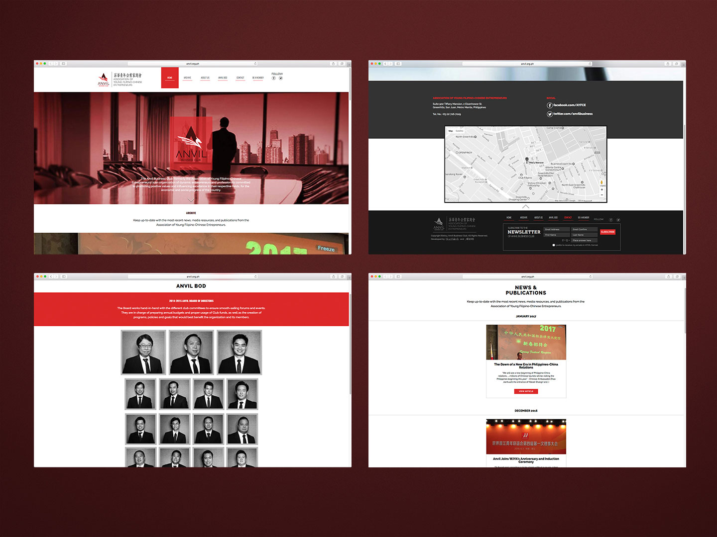
Although they are also known as Association of Young Filipino-Chinese Entrepreneurs, their image did not depict it. Working with the dragon from their original logo, we created a younger looking symbol aligned with the organisation’s goal of attracting a younger generation and signifying a new beginning. The dragon was simplified and given a more contemporary character. The tone of voice was also established, capturing the spirit of a serious business man with tycoon ambitions. In order to ensure consistency and unified branding, we came up with design studies for the website, collaterals, flyers, and recruitment video.
Anvil’s rebranding was a huge success. Membership increased in less than a year since its implementation, and from 89 members in 2013, the numbers have grown to 261 in 2015.
Client
Anvil Business Club
Industry
Business, Civic Groups
Solutions
- Brand Strategy
- Visual Identity
- Brand Positioning
- Logo
Share
|
- Design