Casting light on a bank
Robinson Bank has been operating since 1997 under the JG Summit Group Company.
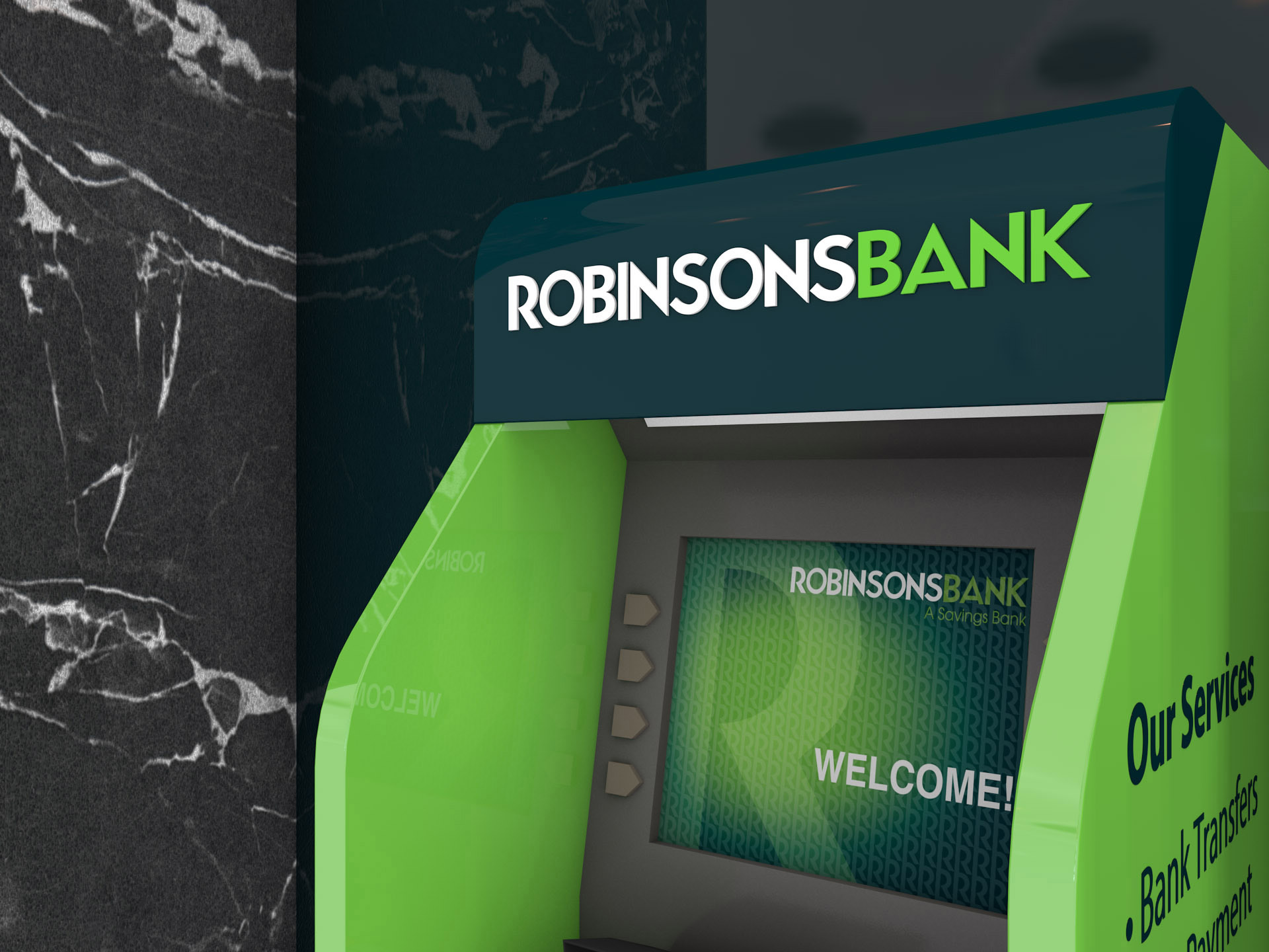
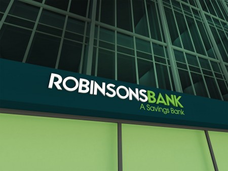
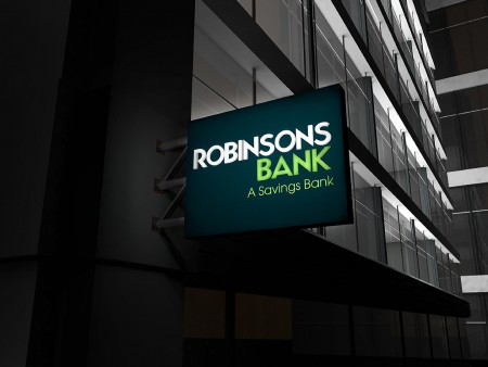
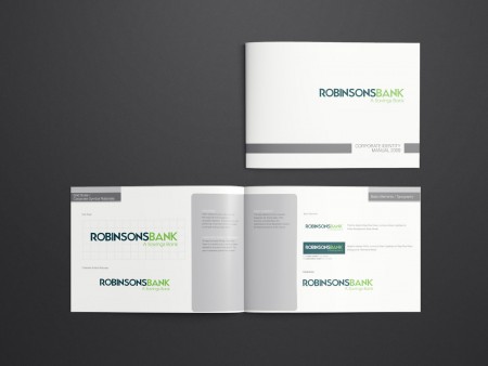
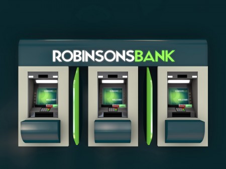
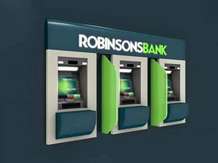
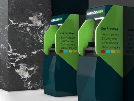
As the brand neared its 10th year anniversary, they decided that a new image was needed. Most of the banks in the Philippines during that time weren’t easy to distinguish from one another. For the visual identity, we used an uncommon shade of dark green since it projected strength and a bright green to communicate vitality since they wanted to cater to a younger market. The large letter “R” is a representation of the conglomerate that owns the bank. Aside from just the look, we considered how the logo design would translate to the bank signages since their old signs were dominantly white, thus, gathering more dirt than attention.
Robinsons bank has now grown to 112 branches nationwide maintaining its visibility and catching the eyes of passers-by.
Client
Robinsons Bank
Industry
Finance
Solutions
- Design
- Retail & Environment
- Brand Guidelines
Share
|
- Brand Strategy
- Visual Identity
- Logo
